This article is an example of a donut Kendo Chart Component. The framework used is Kendo UI for jQuery. Strangely enough, a 0% value isn’t displayed by a donut Kendo Chart but is displayed by a pie Kendo Chart. In this example, we will make the donut Kendo Chart display the 0% value.
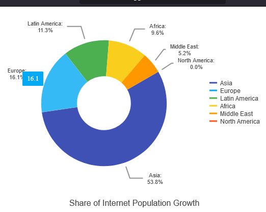
Before we go straight to the solution, let us see the problem first. Set the “North America” value to 0, value: 0 and make sure the type is “donut”, type: "donut".
We should have something like below:
Now, keep everything the same and change the type to pie, type: "pie" and we should have something like below:
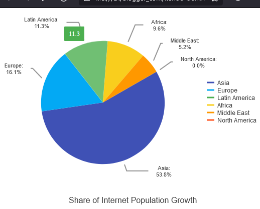
See the difference? On a pie Kendo Chart, 0% is shown. On a donut Kendo Chart, 0% isn’t shown. Even though they have the same values. Don’t ask me why because I don’t know the reason behind it. Fortunately, we can trick the Kendo Chart into showing the 0% value.
Here is our solution. You can edit the code below using any text editor but I prefer Visual Studio Code. Make sure you are connected to the Internet because the code pulls the Kendo library from the Telerik CDN. Take note that this is just a demonstration code and you’ll need to purchase a license if you are going to use Kendo UI for jQuery for more than just evaluation purposes.
<!-- https://jpllosa.blogspot.com/ -->
<!DOCTYPE html>
<html>
  <head>
    <title>Kendo Donut Chart With 0% Example</title>
    <link rel="stylesheet" href="https://kendo.cdn.telerik.com/2021.2.616/styles/kendo.default-v2.min.css" />

    <script src="https://kendo.cdn.telerik.com/2021.2.616/js/jquery.min.js"></script>
    <script src="https://kendo.cdn.telerik.com/2021.2.616/js/kendo.all.min.js"></script>
  </head>
  <body>
    <div id="chart"></div>
    <script>
      $(document).ready(function() {
        $("#chart").kendoChart({
          theme: 'material',
          title: {
            position: "bottom",
            text: "Share of Internet Population Growth"
          },
          legend: {
            visible: true
          },
          seriesDefaults: {
            type: "donut",
            // type: "pie", // kendo-pie-chart-showing-0-percent.png
            startAngle: 150
          },
          series: [{
            name: "2012",
            data: [{
              category: "Asia",
              value: 53.8,
            },{
              category: "Europe",
              value: 16.1,
            },{
              category: "Latin America",
              value: 11.3,
            },{
              category: "Africa",
              value: 9.6,
            },{
              category: "Middle East",
              value: 5.2,
            },{
              category: "North America",
              // value: 0, // kendo-donut-chart-missing-0-percent.png
              value: 0.001,
            }],
            labels: {
              visible: true,
              background: "transparent",
              position: "outsideEnd",
              template: "#= category #: \n #= kendo.toString(value, '0.0') + '%'#",
            },
          }],
          tooltip: {
            visible: true,
            template: "#= value!=0.001 ? value : '0' #",
          }
        });
      });
    </script>
  </body>
</html>
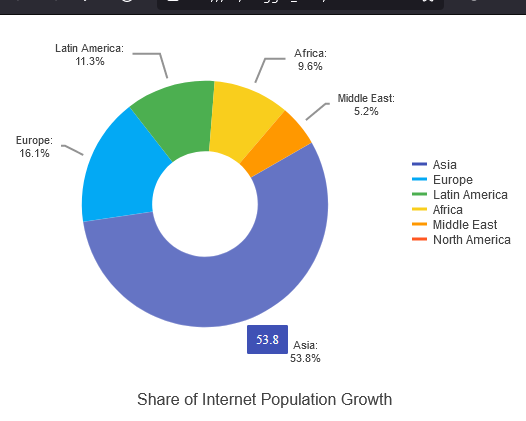
The trick is to change the value to something way below zero. In our example it is 0.001. So we set “North America” to value: 0.001. And then handle the tool tip and label by adding some template logic. Don’t forget to set type: "donut". This is how it looks now:
There you have it. A quick and simple example of a Kendo Donut Chart with 0%.
Leave a Reply